Chapter 5 Exploratory Data Analysis
5.1 Demographics of Motorists Stopped, Nationwide
We begin our exploratory data analysis by examining the recorded race, age, and sex of motorists involved in traffic stops. The goal of this section is to provide a high-level view of our 75 datasets. In particular, we see similarities and differences among states or cities. One trend is the consistently higher relative proportions of younger Black and Hispanic drivers than younger white drivers in their respective racial group. One notable variation is the police search rate: the white search rate in New Jersey is more than 75%, while the search rate for most other states and races is less than 25%. From these simple descriptive statistics, we pose further questions for the subsequent analyses of individual datasets in the next section.
A concurrent goal of this section is to sense the potential (and limitations) of working with our data. While querying one dataset to generate a dataset-level plot is feasible, I use SQL commands SELECT, COUNT, and GROUP BY to circumvent the memory problem posed by generating a national-level plot. Furthermore, the ubiquitous baseline problem (the lack of traffic data to serve as a denominator for our traffic stop data) crops up when interpreting these initial visualizations. Lastly, we gauge the comprehensiveness of our data. Missing data within individual datasets and missing variables within our datasets limit the size of our observations. Thus, this exercise provides a rough scope of what can and cannot be done with our data and foregrounds our remaining analyses.
5.1.1 Set Up
I first load the following packages. The package geofacet enables nationwide plots to be displayed in a map-like manner. I also connect to our SQL server, but that code is excluded here because of privacy.
## Warning: package 'geofacet' was built under R version 3.6.2I query the entire Oakland dataset. Before creating each nationwide visualization, I first use the Oakland dataset to create a local-level version. I include the intermediate Oakland visualizations in this section to illustrate the different methods of preparing city-level versus nation-level plots. Also, the intermediate plot adds some coherency to the interpretation and significance of the nationwide plot.
5.1.2 Race and sex of stopped motorists
This visualization will show the breakdown, by race and sex, of motorists who were stopped in a given dataset. I convert the counts of motorists in each demographic category to be in percentages, which conveys the relative size of each demographic group to the rest of the drivers stopped. (Crucially, this percentage does not compare the size of the demographic group to all drivers.)
The first version relays information from just one data set, Oakland, and the second version makes use of all data sets that record race and sex. Neither visualization conveys the extent of missing information; that is, I ignore the traffic stops in which race and/or sex are missing under the assumption that patrol officers fail to record data uniformly across motorists of different demographic groups.
5.1.2.1 Race and sex of stopped motorists in Oakland
For the Oakland visualization, I use dplyr functions to calculate the percent of stops in each racial group. Then, I plot the data in a bar chart.
CAoak %>%

  # remove missing data
  filter(!is.na(subject_sex) & !is.na(subject_race)) %>%

  # use group_by and summarize to count number of stops per category
  group_by(subject_sex, subject_race) %>%
  summarize(count = n()) %>%
  ungroup() %>%

  # find the percentage of age/race stops
  mutate(percentage = round(prop.table(count), digits = 2)) %>%

  # plot percentages
  ggplot(mapping = aes(x = subject_sex, y = percentage, fill = subject_race,
                       label = scales::percent(percentage))) +
  geom_bar(position = "dodge", stat = "identity") +

  # adjust labels
  geom_text(position = position_dodge(width = .9),
            vjust = -0.5,
            size = 3) +
  scale_y_continuous(labels = scales::percent)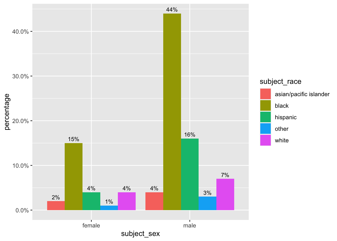
We observe that within each racial group, the percentage of stopped males is double that for females. We cannot conclude, though, that a Black male driver is twice as likely than a Black female drive to be stopped.
Additionally, we cannot conclude anything about over- or under-representation of racial groups in the stop data. Although we can concretely point out that 7% of stopped drivers in Oakland are white males, we do not possess if that 7% should be higher or lower in the absence of discriminatory traffic patrol behavior.
5.1.2.2 Race and sex of stopped motorists, nationally
The national level plot contains information only for races white, Black, and Hispanic for greater ease of interpretation on the larger plot. To create a national version of the age race bar graph, I do the following:
5.1.2.3 1. Create a list of relevant datasets
I use the function relevant_datasets to find the datasets that have variables subject_sex and subject_race.
5.1.2.4 2. Query and clean data
With the relevant data sets for the nationwide demographic visualization, I can run SQL queries on those data sets. I write the function query_count_RaceSex that takes as input a data set name and returns a cleaned dataframe with the percentage of each racial group calculated from a 50% random sample of each data set.
query_count_RaceSex <- function(dataset_name){

  dataset_str = paste(dataset_name)

  # take a 50% random sample of each dataset for speed
  command <- paste("SELECT subject_race, subject_sex, COUNT(*) as 'stops' FROM",
                   dataset_str,
                   "WHERE rand() <= .5 GROUP BY subject_race, subject_sex",
                   sep = " ")

  # query the data
  demographics_dataset <- dbGetQuery(con, command)

  if(dim(demographics_dataset)[1] < 1){

    # disregard empty dataset
    return(NULL)

  }

  # clean dataset a bit
  demographics_dataset <- demographics_dataset %>%

    # use substr(), later on, to index into string and denote dataset
    mutate(dataset = paste(dataset_str),

           # make subject_age to be type double
           stop_percent = prop.table(stops))

return(demographics_dataset)

}
Using base R’s lapply function, I create a list of data frames with variables: race, sex, percent of stops, and data set name.
5.1.2.5 3. Combine and plot
I combine the list of data frames – each row of this combined data frame has the percentage of motorists stopped in each demographic group. Next, I filter the data to include only demographic groups that are a combination of male and female with white, Black, and Hispanic. Through this, I also exclude percentage observations for which sex and/or race is not recorded. I limit my visualization to only include three races for ease of interpretation.
# filter out missing data and certain races
race_sex_all <- bind_rows(race_sex_list, .id = "column_label") %>%

  filter(subject_sex == "female" | subject_sex == "male") %>%

  filter(subject_race == "white" | subject_race == "hispanic" | subject_race == "black")

# plot of race and sex distribution
race_sex_all %>%
  ggplot(mapping = aes(x = subject_sex, y = round(stop_percent, digits = 2), fill = subject_race, label = scales::percent(round(stop_percent, digits = 2)))) +
  geom_bar(position = "dodge", stat = "identity") +

  # add annotations
  geom_text(position = position_dodge(width = .9),
            vjust = -0.5,
            size = 2) +
  scale_y_continuous(labels = scales::percent) +
  facet_wrap(~ dataset) +
  ylab("percentage")

ggsave("race and sex distribution.png", width = 11, height = 9, units = "in")
Observations:
There are more male drivers stopped than female drivers stopped across near all racial groups and data sets. While the reason for this trend is outside the scope of this report, this trend informs our future analyses to consider disaggregating stop or search behavior by sex. Indeed, this is what Rosenfeld et al. do – they examine search probabilities of only stops involving male drivers.
There is no clear unifying trend of the racial distributions among the data sets. This reflects the range of variables that determine racial breakdown of stopped drivers – residential population, driving population, driving behavior, and traffic behavior are just a few.
This plot gives us a broader sense of how finding evidence of discrimination is difficult. We do not know what the racial percentage of traffic stops should be; without a comparison, we cannot conclude is a population is over- or under-represented.
Data collection is far from uniform. We observe that for data sets like MSstatewide and KYowensboro, there are no Hispanic drivers stopped; perhaps officers recorded motorists as “other.”
5.1.3 Distribution of motorists’ age by race
This next visualization shows the density of motorist ages, by race, who were stopped in a given data set. For ease of interpretation, I only plot age densities for motorists recorded as white, Black, and Hispanic. To calculate the kernel density of each age group, I use ggplot’s geom_density function. Geom_density is a smoothed version of a histogram; the percentage of stopped drivers in a given racial group that is in a given age range is relayed by the area of the curve for that age range.
As in the race and sex visualization, the percentages (or kernel estimates) for each age group do not relate drivers stopped at a certain age with all drivers in the area. Instead, the densities relate drivers stopped at a certain age with other drivers stopped.
The first visualization relays information from just one data set, Oakland, and the second version makes use of all data sets that record subject age and race. Neither visualizations relay the extent of missing data, making use only of the observations that have age and race recorded. Also, I limit the range of subject ages to be less than 80.
5.1.3.1 Age distribution by race in Oakland
For the Oakland plot, I simply pipe the filtered Oakland data into ggplot. I let transparency, denoted by alpha, equal .5 to more easily discern trends in the graph.
CAoak %>%
  filter(subject_age < 80) %>%
  filter(subject_race != "other" & subject_race != "asian/pacific islander") %>%
  ggplot +
  geom_density(mapping = aes(x = subject_age, fill = subject_race, color = subject_race), alpha = .5)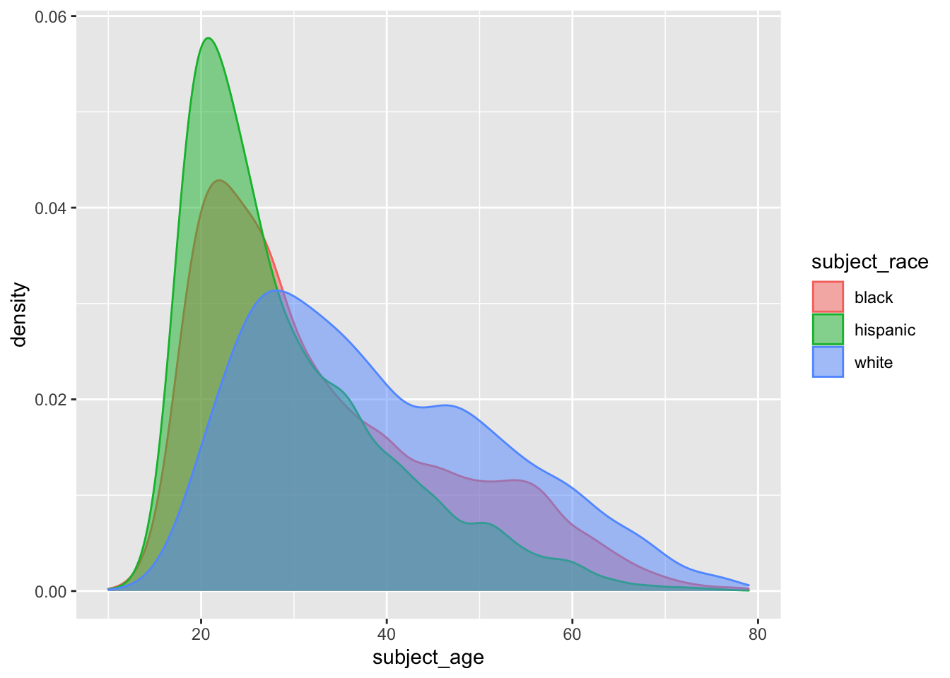
Observations:
The densities of people of color (POC) drivers stopped is more skewed right than that for white drivers, with greater weights at younger ages.
The densities of POC drivers decline faster between ages 20-40 than that for white drivers. The relative weights of POC drivers age 30 and older is, in fact, lower than that for white drivers that age.
A note on interpretation: again, the denominator of the kernel estimates is all other drivers who were stopped. This graph doesn’t say that younger POC drivers are more likely to be stopped than younger white drivers. Rather, of the drivers stopped, younger POC drivers are represented more frequently than same-age white drivers.
5.1.4 Age distribution by race, nationally
The national level plot contains information only for races white, Black, and Hispanic and ages less than 80. To create a national version of this age density plot, I do the following:
5.1.4.1 1. Create a list of relevant datasets
I use the function relevant_data sets to find the data sets that have variables subject_age and subject_race.
5.1.4.2 2. Query and clean data
With the relevant data sets for plotting age distribution, I write a function query_clean_AgeRace. As input, the function takes a data set name and returns a 50% random subset of the data frame; I only query the age and race columns for efficiency and memory reasons. Thus, I also limit my subsetted data for races white, Black, and Hispanic and for motorists under the age of 80. (Originally, I planned to use the COUNT and GROUP BY commands in SQL but could not find a way for geom_density to take the number of stops as inputs.)
query_clean_AgeRace <- function(dataset_name){

  dataset_str = paste(dataset_name)

  # introduce cap of age 80 for motorists b/c querying big data leads to problems
  # take a 50% sample of each dataset
  command <- paste("SELECT subject_age, subject_race FROM",
                   dataset_str,
                   "WHERE (subject_race = 'black' OR subject_race = 'white' OR subject_race = 'hispanic') AND subject_age > 0 AND subject_age < 80 AND rand() <= .5",
                   sep = " ")


  age_dataset <- dbGetQuery(con, command)

  if(dim(age_dataset)[1] < 1){

    # disregard empty dataset
    return(NULL)

  }

  # clean dataset a bit
  age_dataset <- age_dataset %>%

    # use substr(), later on, to index into string and denote dataset
    mutate(dataset = paste(dataset_str),

           # make subject_age to be type double
           subject_age = as.double(subject_age))

return(age_dataset)

}
Using the lapply function, I create a list of data frames with variables: race, age, and data set name. Each row in these data frames contains information on one traffic stop from a data set.
5.1.4.3 3. Combine and make intermediate plot
I combine the list of data frames from the previous step. I also create an intermediate plot that does not use geofacet but simply facets by the data set, so city and statewide data sets are plotted separately.
age_race_all <- bind_rows(age_race_list, .id = "column_label")

# plot of racial age distributions per dataset

age_race_all %>%
  ggplot() +
  geom_density(aes(x = subject_age, color = subject_race), alpha = .3) +
  facet_wrap(~ dataset)

ggsave("racial age distribution without fill.png", width = 11, height = 9, units = "in")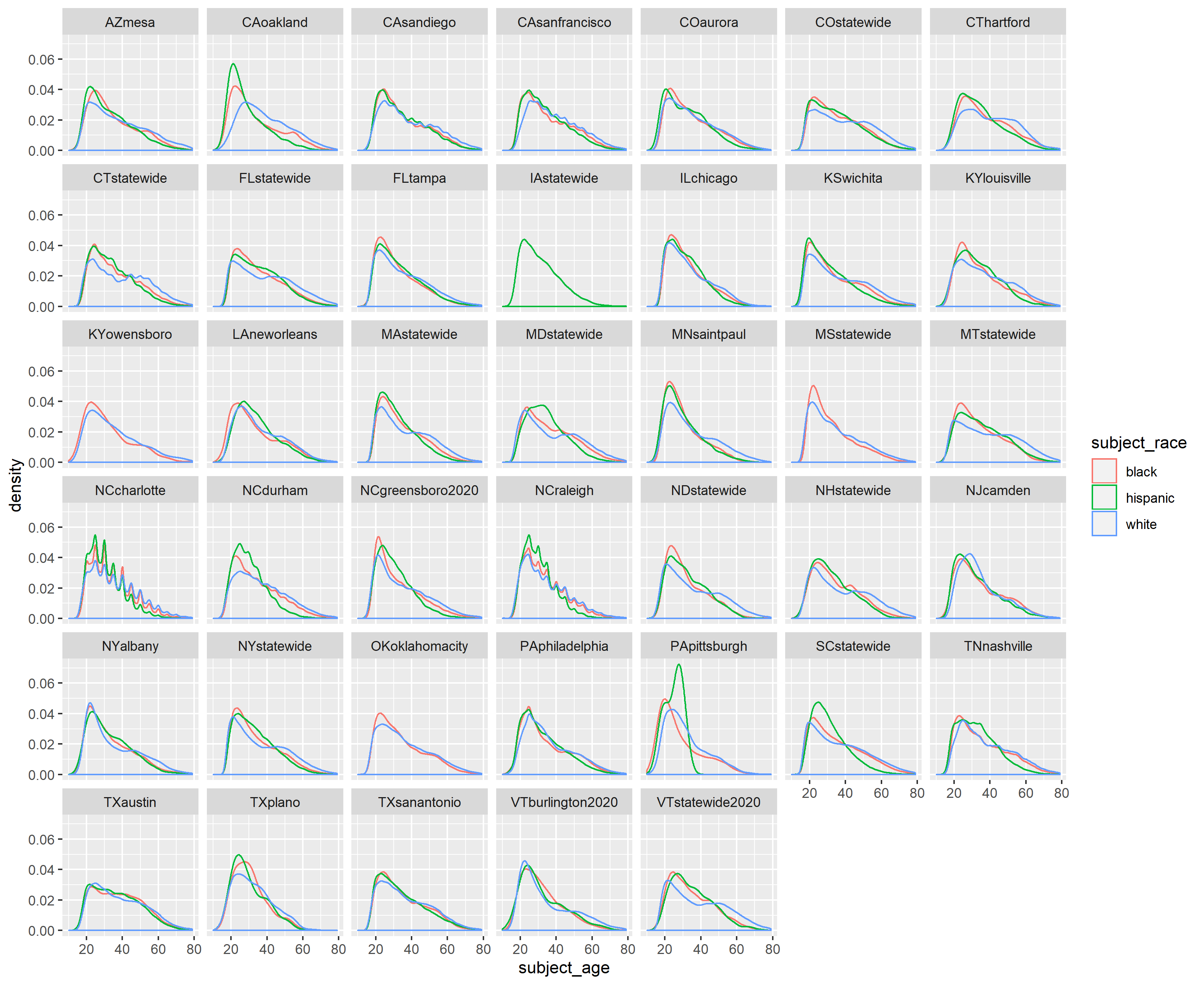
Observations:
For the current racial age distribution plot, the blue lines representing white drivers reach their maximum density level that is usually almost always less than the maximum densities of red and green lines, representing Black and Hispanic drivers. As in the Oakland-level plot, we thus see how across data sets, the densities of people of color drivers stopped is more skewed right than that for white drivers, with greater weights at younger ages.
The densities of POC drivers usually decline faster between ages 20-40 than that for white drivers. That is, the slope for POC drivers is usually steeper than for white drivers between those ages. The blue lines seem to peak around age 25 to 30 before decreasing, only to plateau at between ages 40 and 50. The relative weights of POC drivers age 30 and older is, in fact, lower than that for white drivers that age.
By examining the data sets together, we can discern how the age densities of Oakland are not exactly replicated in other places. When we aggregate some data data sets to plot by state, some of the granularity among intra-state age distributions will be lost.
Also, by examining the data sets together, we are reminded of uneven data collection. Iowa statewide (IAstatewide) only has a green line because subject_race is recorded most frequently as NA, then “other.” I checked Iowa’s data set and found that stops with race recorded as Hispanic make up less than 2.5% of the total stops recorded. Also, the spikes in the North Carolina data sets is probably indicative of patrol practices of estimating ages of stopped motorists.
One possible future direction would be to plot the data into two separate plots, one for male and one for female.
5.1.4.4 4. Plot using geofacet
The next part of cleaning is extracting state name using stringr. By extracting the state abbreviation from the “dataset” variable, I can later pipe the data into geofacet to create a map-like plot.
age_race_all <- age_race_all %>%

  # create state and city variables using substrings
  mutate(state = substr(dataset, start = 1, stop = 2),

         # city variable will be "statewide" if data set isn't city level
         city = ifelse(str_detect(dataset, "statewide"), state,
                      str_extract(substr(dataset, start = 3, stop = nchar(dataset)),
                                  "[a-z]+")))
Because I extract the state abbreviation from the “dataset” variable, I can now pipe the data into ggplot, using geofacet to create a map-like plot.
ggplot(data = age_race_all, aes(x = subject_age, color = subject_race)) +
  geom_density(alpha = .3) +
  facet_geo(~ state) +
  theme_bw()

ggsave("geofacet racial age distribution.png", width = 11, height = 9, units = "in")
Observations:
We do lose some granularity from the differences in patrol behavior per state, but the peaks and slope observations from the previous two plots still hold here. For brevity, I include them both here: the densities of people of color drivers stopped is more skewed right than that for white drivers, with greater weights at younger ages. Furthermore, the densities of POC drivers usually decline faster between ages 20-40 than that for white drivers.
By placing the plots in geographic relation to one another, the extent of uneven data collection becomes clearer. Only 45 out of our total 75 data sets have the two variables necessary to generate this plot.
5.1.5 Search rates
For this last nationwide visualization, we examine the search rates of different states, disaggregated by race. The search rate is calculated by taking the total number of searches and dividing by the total number of stops; it represents a conditional probability of being searched given one is stopped.
5.1.6 1. Query the data
We use the conveniently formatted datasets opp_stops_state and opp_stops_city. The two data sets have the following variables: search_rates, stops_rates, and subject_race for every state.
5.1.7 2. Transform data
We then combine certain observations from the two data sets to maximize our state coverage. Next, to find the average stop rate per racial group and state, I use tidyverse functions group_by (by race and state) and summarise; then, I average the stop rates.
As I am taking the simple average, this average stop rate does not reflect the different number of stops per data set in a given state. For example, in a given state, say that there are two police departments, one that conducts 1 million stops total and one that conducts 1,000 stops total. In my average search rate, the search rates of both these hypothetical police department is weighted equally.
# retrieve additional states from the opp_stops_city dataset
opp_stops_state <- rbind(opp_stops_state, opp_stops_city %>%
                           filter(state=="NJ" | state=="OK" | state=="PA" | state=="KS" | state=="KY" |  state=="LA" | state=="MN")) %>%

  # We only want to look at states, race, and stop_rate; this could be
  # modified to display other variables
  select("state", "subject_race", "stop_rate") %>%

  # find average stop rate per racial group per state
  group_by(subject_race, state) %>%
  summarise(stop_rate = mean(stop_rate))
5.1.8 3. Plot using geofacet
The first nationwide plot is a bar chart, faceted by states.

observations:
The main takeaway from this bar plot is that the search propensity of police departments (aggregated into states) varies widely. States like New Jersey, Pennsylvania, and Montana are the only states with search rates for a racial group that reach 25%.
The majority of states have average search rates under 25%; for these states, this chart is not particularly useful for seeing trends because of axis scaling.
Presented with these search rates, we are again confronted with the difficulty of proving discrimination. Looking at search rates by race alone does not provide convincing evidence of or against racial profiling.
5.1.9 4. Use scatter plot to examine ratios
The second nationwide plot makes use of scatter plots and relays the ratio of search rates between Black and white and Hispanic and white search rates. I use color coding for the ratio of the search rate for a POC group to the corresponding white search rate.
Each dot in the following graphs represents one state. I include a y = x line to indicate where the ratios would be, if they were equal.
opp_stops_state %>%
  ungroup(subject_race) %>%
  spread(key = subject_race, value = stop_rate) %>%
  ggplot(aes(x = white, y = black, color = black/white)) +
  geom_point() +
  geom_abline(slope=1, intercept=0) +
  xlab("white search rate") +
  ylab("Black search rate") +
  scale_colour_gradient(low = "#56B1F7", high = "#FA5858", limits = c(0, 3.5))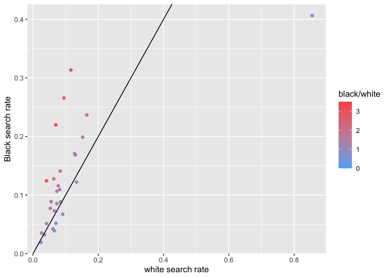
opp_stops_state %>%
  ungroup(subject_race) %>%
  spread(key = subject_race, value = stop_rate) %>%
  ggplot(aes(x = white, y = hispanic, color = hispanic/white)) +
  geom_point() +
  geom_abline(slope=1, intercept=0) +
  xlab("white search rate") +
  ylab("Hispanic search rate") +
  scale_colour_gradient(low = "#56B1F7", high = "#FA5858", limits = c(0, 3.5))
Observations:
- The recorded Black-white search rate per state is generally greater than one, while the recorded Hispanic-white search rate is generally less than one. Reasons for these discrepancies range from poor data collection to discrimination, but which factors are driving this difference is far outside the scope of this plot.
5.2 Dataset-specific Exploration
5.2.1 Stop outcomes from day to night in Oakland, CA
This section of data analysis incorporates our day variable with stop outcomes in the Oakland data set.
5.2.1.1 Set up
I use the following packages for this analysis. Suncalc, lutz (a cute acronym for “look up time zone”), and lubridate are necessary for calculating sunset and sunrise times. I also connect to our SQL server, but that code is excluded here because of privacy.
Next, I query the entire Oakland data set to be available locally. I also clean the data by removing the entries that do not record data, parsing my date and time variables with lubridate, and creating a POSIX type time variable that will serve as an input for suncalc functions.
CAoak <- DBI::dbGetQuery(con, "SELECT * FROM CAoakland")

# Lubridate
CAoak <- CAoak %>%
  filter(!is.na(date)) %>%
  mutate(nice_date = ymd(date),
         nice_year = year(nice_date),
         nice_month = month(nice_date),
         nice_day = day(nice_date),
         nice_time = hms(time),
         nice_day_of_year = yday(date),

         #for sunset sunrise:
         posix_date_time = as.POSIXct(paste(nice_date, time), tz = "America/Los_Angeles", format = "%Y-%m-%d %H:%M:%OS"))
## Warning in .parse_hms(..., order = "HMS", quiet = quiet): Some strings
## failed to parse, or all strings are NAs5.2.1.2 Set up sunset/sunrise times in CA Oakland
Next, I use the function we wrote, oursunriseset, and dplyr functions to create a new set of variables in the Oakland data. For each stop, we analyze the time of day and day of the year to categorize the stop as either occurring during the day (for which the new variable light would be “day”) or during the night (for which light would be “night.”
When I use the suncalc function getSunlightTimes, I let the input timezone be the Oakland timezone.
OaklandTZ <- lutz::tz_lookup_coords(37.75241810000001, -122.18087990000001, warn = F)

oursunriseset <- function(latitude, longitude, date, direction = c("sunrise", "sunset")) {

  date.lat.long <- data.frame(date = date, lat = latitude, lon = longitude)

  if(direction == "sunrise"){

    getSunlightTimes(data = date.lat.long, keep=direction, tz = OaklandTZ)$sunrise }else{
      getSunlightTimes(data = date.lat.long, keep=direction, tz = OaklandTZ)$sunset } }
Next, I run oursunriseset on the Oakland data set, using mutate to create the intermediate variables, sunrise and sunset, and the light variable. I remove the traffic stop observations for which time was not recorded.
# add light variable
CAoak <- CAoak %>%

  # use oursunriseset function to return posixct format sunrise and sunset times
  mutate(sunrise = oursunriseset(lat, lng, nice_date, direction = "sunrise"),
         sunset = oursunriseset(lat, lng, nice_date, direction = "sunset")) %>%

  mutate(light = ifelse(posix_date_time > sunrise & posix_date_time < sunset, "day", "night")) %>%

  # about 100 NA's to filter out

  filter(!is.na(light))

# knitr::kable((CAoak %>% select(posix_date_time, subject_race, light) %>% head()))
This short excerpt of the transformed Oakland data set shows how the time of stop and light variable correspond to one another.
5.2.1.3 Stop outcomes, by race and day/night
With the set up done, we can begin plotting stop outcomes related to day and night!
5.2.1.3.1 Counts, by race
The bar chart shows the number of stops per race occurring during the day and night.
# see how drivers are stopped by race and light in absolute counts
ggplot(data = CAoak) +
  geom_bar(mapping = aes(x = subject_race, fill = light))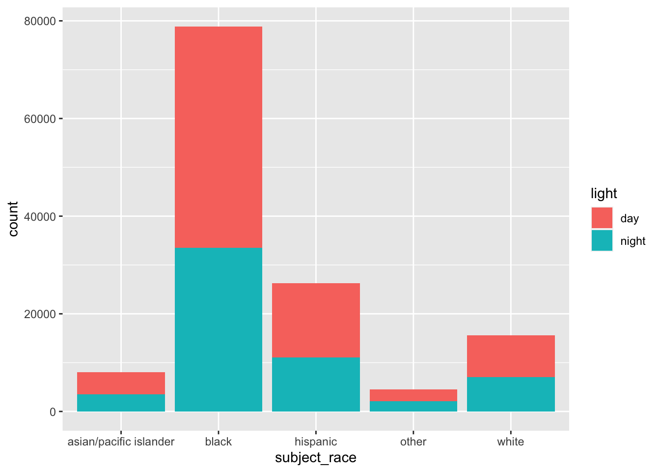
The bar chart relays effects of a slew of variables, such as driving behavior of a time of day, time of year, and racial group; traffic and patrol behavior for a given time and location is also relayed. Thus, again, we cannot make definitive statements about racial profiling.
As in the veil of darkness assumption, the race of a motorist is harder to discern during the night than during the day. However, just because the day-night bars in each racial group looks to be about equal neither corroborate nor denies racial profiling. We are without information on the true traffic infringement rate per racial group in different times of the day.
5.2.1.4 Day/night outcomes of stop by race
Next, I examine how outcome of stop, race, and day/night interact. I pipe the Oakland data set into ggplot, allowing the color of each bar to represent a traffic stop outcome and the transparency of the bars to denote day and night stops.
# how are outcomes of stops affected by race and time of day?

CAoak %>%
  ggplot(aes(x = subject_race, fill = outcome, color = outcome, alpha = light)) +
  geom_bar(position = "dodge") +
  scale_alpha_manual(values = c(.2, .9))
Observations:
For each type of outcome and race, stops during the day outnumber stops during the night. This may result from the Oakland police department’s patrol patterns, driver behavior during the day, and/or another factor.
Missing data regarding traffic outcome does not look to be evenly distributed among stopped motorists – missing data during the day and night look to be about the same for all racial groups except for Black.
Citations look to be the most frequent outcome of traffic stops for all racial groups, followed by warning, then arrest (not including missing data.)
Future directions could look more deeply into the probabilities of each of these outcomes for different racial groups, as the nature of a stricter outcome (being issued a citation rather than a warning) may not be uniformly distributed among racial groups. Furthermore, incorporating the light variable in this direction could be illuminating: are traffic patrols more lenient during the day or during the night once a motorist is stopped? Does the extent of this leniency differ for different racial groups?
5.2.2 Stop outcomes in San Diego, CA
5.2.2.1 Significance of Stop Outcomes
It is helpful to look at the distribution of stop outcomes because it could suggest underlying intent from the officer or commonalities in policing different races (i.e. prevalence of profiled searches, warrant for arrest). Additionally, it can communicate trends in policing behavior in regards to race of a particular police department. The following visualizations display the distribution of searches and arrests made on traffic stops in San Diego.
5.2.2.2 Recoding Race column in San Diego Dataset
Unlike many datasets, in San Diego, subject race is recorded in a very detailed and consistant manner. However, for the purpose of comparing with other datasets used in the Stanford Open Policing Project, the below race selections were recodded as "ASIAN/PACIFIC ISLANDER" to reflect how race is categorized by police departments in other cities and states. The recode function can be used to recode entries in the raw_subject_race_description column as such. Here the recode function is used to overwrite some raw_subject_race_description entries as "ASIAN/PACIFIC ISLANDER".
goodSD$raw_subject_race_description <- recode(goodSD$raw_subject_race_description,
    VIETNAMESE = "ASIAN/PACIFIC ISLANDER",
    SAMOAN = "ASIAN/PACIFIC ISLANDER", LAOTIAN = "ASIAN/PACIFIC ISLANDER",
    KOREAN = "ASIAN/PACIFIC ISLANDER", JAPANESE = "ASIAN/PACIFIC ISLANDER",
    INDIAN = "ASIAN/PACIFIC ISLANDER", HAWAIIAN = "ASIAN/PACIFIC ISLANDER",
    GUAMANIAN = "ASIAN/PACIFIC ISLANDER",
    FILIPINO = "ASIAN/PACIFIC ISLANDER",
    CHINESE = "ASIAN/PACIFIC ISLANDER", CAMBODIAN = "ASIAN/PACIFIC ISLANDER",
    `ASIAN INDIAN` = "ASIAN/PACIFIC ISLANDER",
    `OTHER ASIAN` = "ASIAN/PACIFIC ISLANDER",
    `PACIFIC ISLANDER` = "ASIAN/PACIFIC ISLANDER")
5.2.2.3 Plotting Search Conducted by Race
Below is that code for creating a data table with generated percentages of search and non-search traffic stops in San Diego. The following steps are replicated for person searches, vehicle searches, arrests made, citations issued, and warnings issued.
# create a new dataset
SearchesByRaceCOL <- goodSD %>%
# group by race and search_conducted
# columns
group_by(raw_subject_race_description, search_conducted) %>%

# calculate count for searches conducted
# by race
summarize(Total = n()) %>%
# group by race group
group_by(raw_subject_race_description) %>%

# calculate percentage of searches
# conducted
mutate(pct = Total/sum(Total))

# save the percentages in data table
data.table(SearchesByRaceCOL)

# omit NAs for searches conducted
SearchesByRaceCOL <- na.omit(SearchesByRaceCOL)
Below is a bar plot of SearchesByRaceCOL which visualizes the percentage of traffic stops that resulted in a search binned by race group.
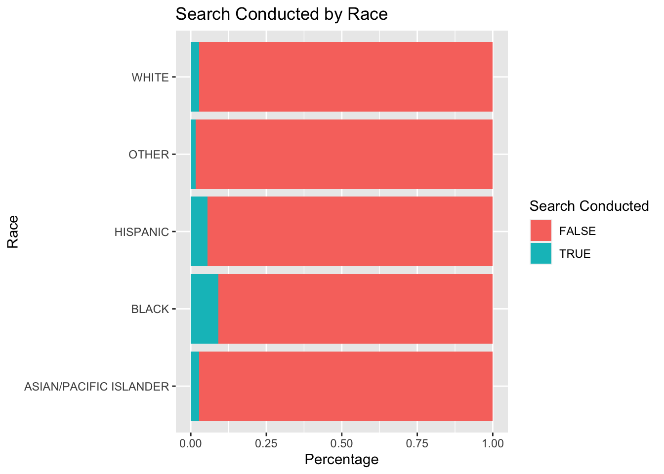
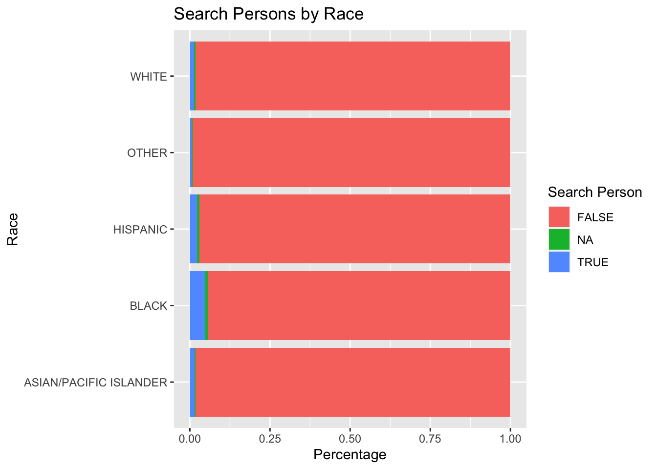
It is important to note that search conducted includes all stops that result in a search of person and search of vehicle but are not composed of entirely of the two. The following two bar plots visualize search of person and search of vehicle percentages by race.
5.2.2.4 Plotting Search Person by Race
5.2.2.5 Plotting Search Vehicle by Race

5.2.2.6 Plotting Arrest Made by Race
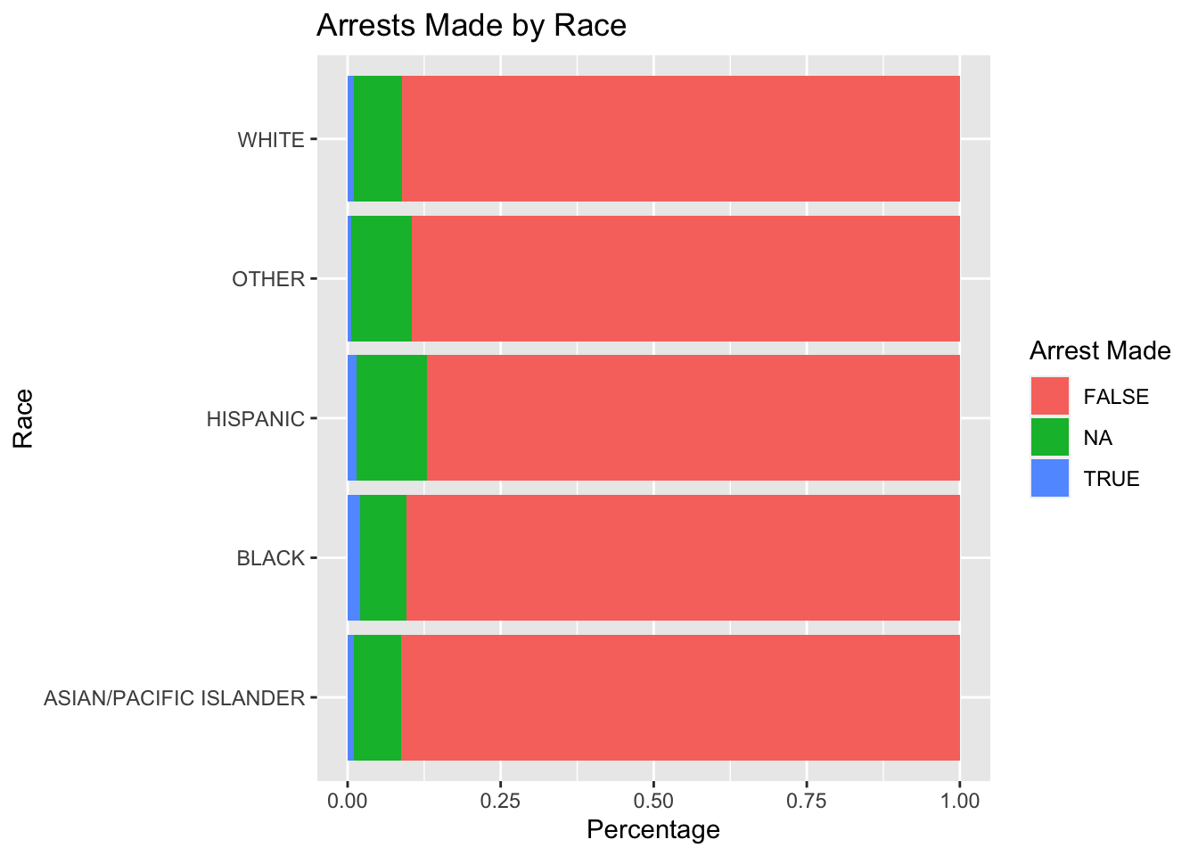
It is important to note that if an arrest was made, it does not necessarily mean that a traffic violation was the cause of arrest. By analyzing the reason for stop column, one can easily see that pedestrians and vehicles are included in the traffic stop data set. Additionally, the data set does not account for stops that were made because of a prexisting arrest warrant which dictates that race was not a motivation in making the arrest/stop.
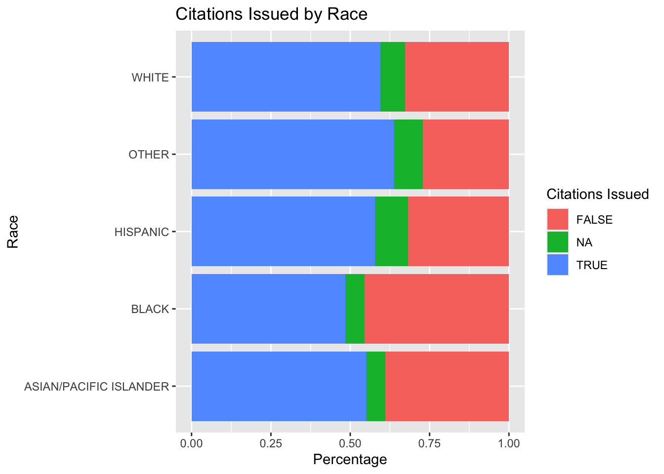
5.2.2.7 Plotting Citations Issued by Race
5.2.2.8 Plotting Warnings Issued by Race
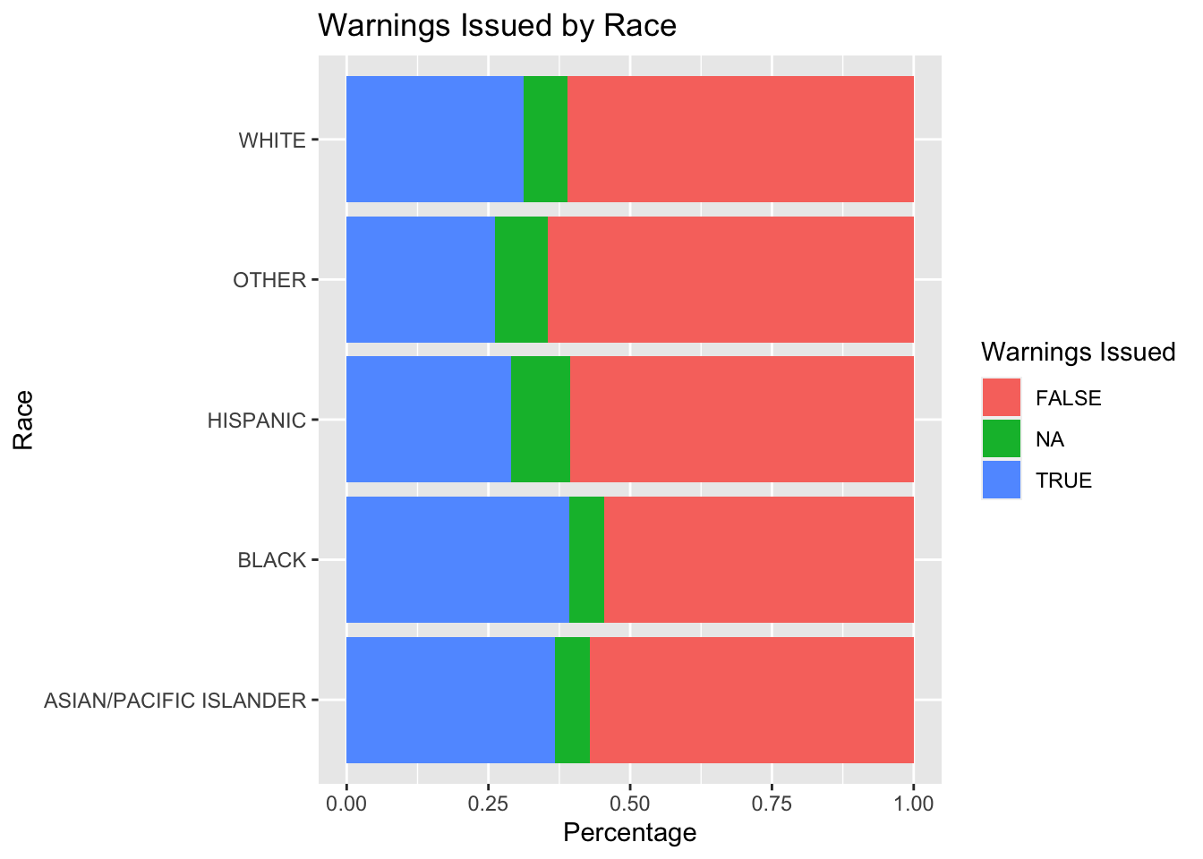
From observing all possible stop outcomes and their proportions, it is observed in San Diego, arrest is not as prevalent in traffic stops. However, citations and warnings are much more prevalent proportionally with relatively equivalent percentages across all races.
5.2.3 Weather overlay in Raleigh, NC
This section of exploratory data analysis sees if precipitation shows correlation with the amount of traffic stops per day. The expected correlation is that if it rains more there will be an increase in traffic stops because wet roads could lead to more reckless driving.
The Rnoaa package requires an API key, which can be acquired from the Rnoaa documentation
5.2.3.1 Visualizing Weather in Raleigh, North Carolina
In this example, we will overlay precipitation over traffic stops in Raleigh February.
In order to get weather data we must call the ncdc function. The key argument to keep in mind is the stationid argument. In order to find a city’s station ID you must go to this NOAA’s website https://www.ncdc.noaa.gov/cdo-web/search. Moreover, the type of data such as precipation, temperature, and snow etc is contingent on the station ID. For this example, we will look at precipitation only, but there is room to explore more variables to see in any affect traffic.
out <- ncdc(datasetid = "GHCND", stationid = "GHCND:USC00317079",
    datatypeid = "PRCP", startdate = "2013-01-01",
    enddate = "2013-12-31", limit = 500)
Now that we have the two datasets we must clean them because we will be joining them.
Here we use the lubridate package to make year, month, and day their own columns in the weather dataframe.
weather_df <- data.frame(out$data)

# fix weather_df dates
weather_df <- weather_df %>% mutate(clean_date = ymd_hms(date))

# make individual columns with year,
# month, & day
weather_df <- weather_df %>% mutate(year = year(clean_date),
    month = month(clean_date), day = day(clean_date))
Similarly, the raleigh dataset must also have year, month, and day in separate columns.
# use libridate to add clean date column
# for lubridate to interpret
raleigh <- raleigh %>% mutate(clean_date = ymd(date,
    tz = "UTC"))

# use lubridate to add year, month, day
# columns
raleigh <- raleigh %>% mutate(year = year(clean_date),
    month = month(clean_date), day = day(clean_date))
Now that we have the two dataframes cleaned up, we can follow a sequence of piping commands to join and plot them.
# define month variable so we can easily
# plot different months
month_var = 3
title = paste("Stop Counts with Arrests and Precipitation Day in 2013-",
    paste(month_var))

# the pipe sequence below will examine a
# month in a year such that we count all
# the traffic stops that happened that
# day. Then, we plot the stop counts for
# a specific day and max temp in

raleigh %>% # filter out raleigh entries in year 2013
# and month variable
filter(year == 2013, month == month_var,
    arrest_made == "TRUE") %>% # left_join by 'clean_date'
left_join(weather_df, by = c("clean_date")) %>%
    # Group the data by day as this will be
# our shared x-axis
group_by(day.x) %>% # count the number of stops per day and
# the precipitation value of that day
summarize(count = n(), precipitation = max(value)) %>%
    ggplot() + geom_line(aes(x = day.x, y = precipitation,
    color = "PRCP")) + geom_line(aes(x = day.x,
    y = count/0.05, color = "Stop Count")) +
    scale_y_continuous(sec.axis = sec_axis(~. *
        0.05, name = "Stop Count")) + ggtitle(title)
Based on the plot, it seems like precipitation in day does not impract the amount of stops. For example, the precipitation day 15 and 25 is relatively but stop count still fluctuates. Future analysis could look at the hourly level of stop counts and precipation or a year long look of precipiation and stop counts per day.
5.2.4 Maps in San Antonio, TX
5.2.4.1 Neccessary packages
The following packages provide the tools to begin some geography analysis. Note that a SQL database was also used, but was not included in this code as it is demonstrated in previous sections. Please see https://cran.r-project.org/web/packages/RMySQL/index.html for further instructions in neccessary.
5.2.4.2 Geography Plots
Our work surrounding Geography grew from a general curiosity about the latitude and longitude variables available on some datasets. The EDA on this topic began with a simple plot of the stops in San Antonio.
My first step was querying the SQL database to create a local dataframe with the variables of interest. The variables were the following: longitude, latitude, subject race, subject sex, date of stop, and time of stop. I then cleaned the data to be in the appropriate units for my plot. Note that I include a random sample of the dataframe to lighten the load on the computer system to hopefully increase usability.
# Create a new dataframe with variables
# of interest
coor <- DBI::dbGetQuery(con, "SELECT lng, lat, subject_race, subject_sex, date, time FROM TXsanantonio")

# creates a label to be used for each
# marker in cluster plot
coor <- coor %>% unite(full_label, date,
    time, subject_race, subject_sex, sep = ", ",
    remove = FALSE)

# changes columns to appropriate units
# for plotting and color coding
coor$lng <- with(coor, as.numeric(lng))
coor$lat <- with(coor, as.numeric(lat))
coor$subject_sex <- with(coor, as.factor(subject_sex))

# create a random sample of 20000 to
# decrease load on computer
coor <- sample_n(coor, 20000)
To make my first simple map, I created a base map with longitude and latitude boundaries around San Antonio. Then, using the geom_point function, I plotted the stops over this base map color coding by subject race and varying shapes by subject sex. The grid for the base map can be changed for a hardcoded “zoom”.
# creating the simple map with grid
# latitude and longitude values
map <- get_map(c(left = -99, bottom = 29.2,
    right = -98, top = 29.9))

race_sex_plot <- ggmap(map) + geom_point(aes(x = lng,
    y = lat, color = subject_race, shape = subject_sex),
    data = coor, size = 0.75) + xlab("Longitude") +
    ylab("Latitude") + ggtitle("Simple Overlay Map of San Antonio Stops") +
    coord_quickmap()
race_sex_plot
The next step was to create interactive graphs. To do so, I used the leaflet package. Note that these will not show in the PDF version of this analysis.
The first is a graph similar to the plot over a base map, but allows for zoom and movement. This graph is also color coded by subject race.
#creating a color palette
my_colors <- colorFactor("plasma",
                         domain = c("asain/pacific islander", "black",
                                    "white", "hispanic",
                                    "NA", "other", "unknown"))

#creating the leaflet graph
leaflet(coor) %>% addProviderTiles(providers$Esri.NatGeoWorldMap) %>%
  addCircleMarkers(
    color = ~my_colors(subject_race), # coloring by race
    stroke = FALSE,
    fillOpacity = 1,
    radius = 3) %>%
addLegend(pal = my_colors, values = ~subject_race, opacity = 1)leaflet(coor) %>% addTiles() %>% addMarkers(clusterOptions = markerClusterOptions(),
label = coor$full_label)5.2.4.2.1 Observations, Questions, and Potential Extentions
The investigation of Geography raised many questions and observations. The first observation was that there exist some latitude and longitude value that are not in San Antonio, but rather in Austin, Houston, and some closer to Louisiana. This may be a flaw in the dataset, but could also be that a San Antonio officer was in another city at the time of that stop. Neverless, it presents a potential area of concern for data usability.
One question raised was the potential discrepancies between highway stops and stops in smaller towns for example. There may be differences in demographics for highway and non highway stops and understanding these differences is critical when trying to combat the issue of a denominator explained in the literature review. The cluster plot emphasized the importance of this distinction, with locations on highways having clusters of more than 200 stops for a single longitude and latitude. One many question if there are particular demographics travelling along these cluster locations and if so, how that may impact the stop counts.
Another point of further research can be controlling for demographics of certain neighborhoods or districts and comparing stop rates to those demographics. This can be done a variety of ways and would of course require more data than can be found on the Stanford Open Policing Porject database. One may also look into any information on scheduling for police officers—where they are sent more often, at what points in the day, etc.
5.2.5 Socioeconomic factors in Durham, NC
The reason behind a vehicle equipment stop seems to be an economical one, as drivers who have funds to fix their vehicles in the case of a broken tail light for example would be less likely to get stopped for an equipment violation. The plot is used to investigate this hypothesis, where, as median income increases, we look for the percentage of equipment violations to drop.
# manual data entry
incomeNC <- data.frame(city = c("durham",
"raleigh", "charlotte", "fayetteville",
"greensboro"), medianincome = c(58190,
63891, 60886, 44057, 46702), equipmentstops = c(0.1327,
0.0845, 0.0653, 0.1344, 0.1026), regulatorystops = c(0.2067,
0.248, 0.2166, 0.2632, 0.1758))
# plot for percent of equipment stops
equipment <- incomeNC %>% ggplot() + geom_point(aes(x = medianincome,
y = equipmentstops)) + geom_text(aes(x = medianincome,
y = equipmentstops, label = city), hjust = 0.5,
vjust = -0.5) + labs(title = "Vehicle Equipment Stops vs Median Household Income")
equipment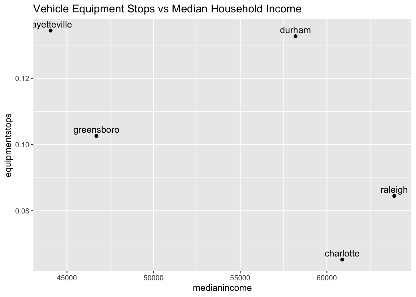 This is a scatter plot of percentage of vehicle equipment stops against median household income (obtained from census.gov). The scatter plot reflects this relationship, however since there are so few observations, maybe more data is needed for a more comprehensive conclusion.
# plot for percent of regulatory stops
regulatory <- incomeNC %>% ggplot() + geom_point(aes(x = medianincome,
y = regulatorystops)) + geom_text(aes(x = medianincome,
y = regulatorystops, label = city), hjust = 0.5,
vjust = -0.5) + labs(title = "Vehicle Regulatory Stops vs Median Household Income")
regulatory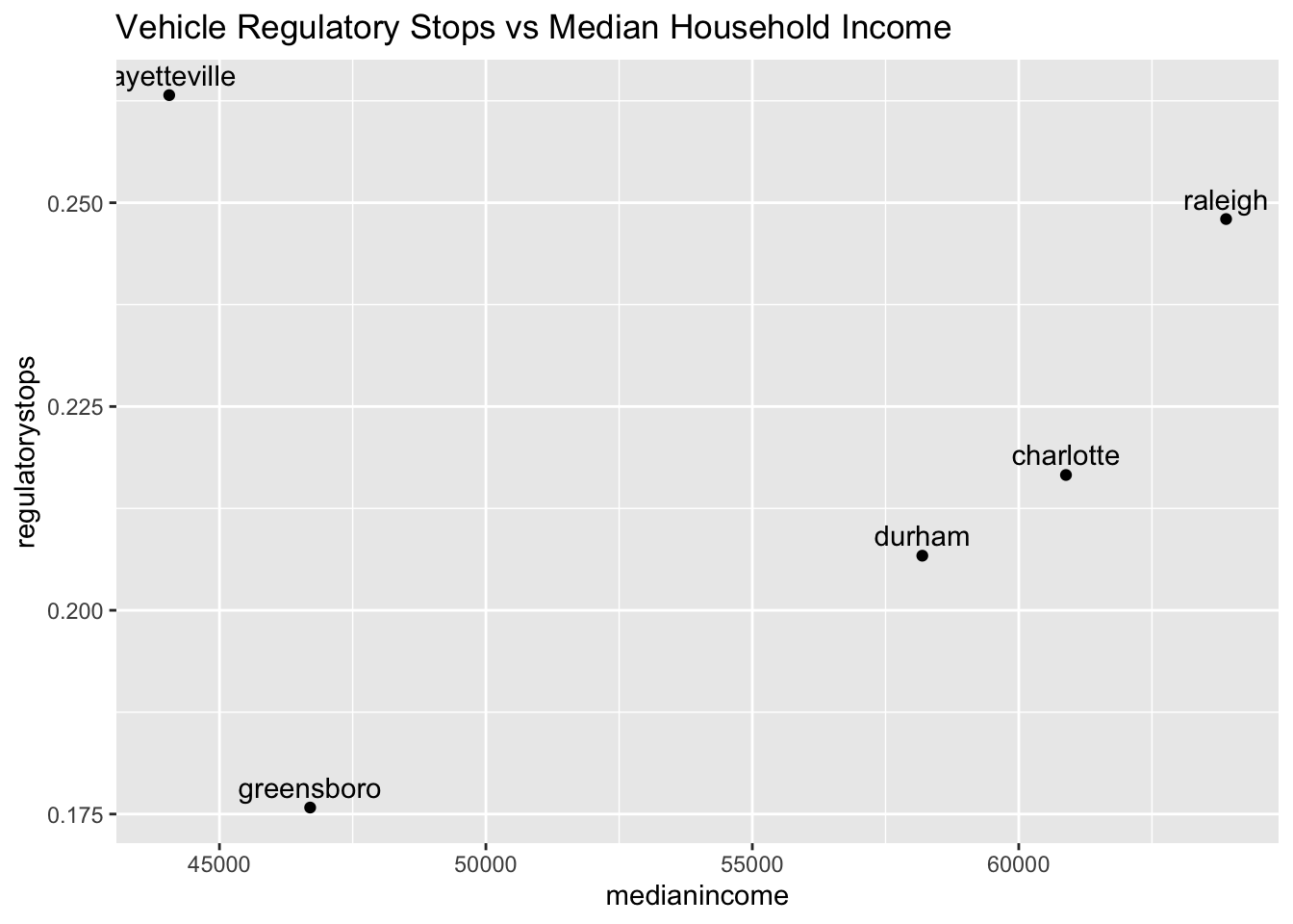 We also look at vehicle regulatory stops against median household income, which also seems to be related to economically implications. Here we see a more clear trend excluding Fayetteville, that there is an increase in percentage stops with the increase of median income.
5.3 Modeling the Probability of Seach Given Stop
5.3.1 Sunrise and Sunset
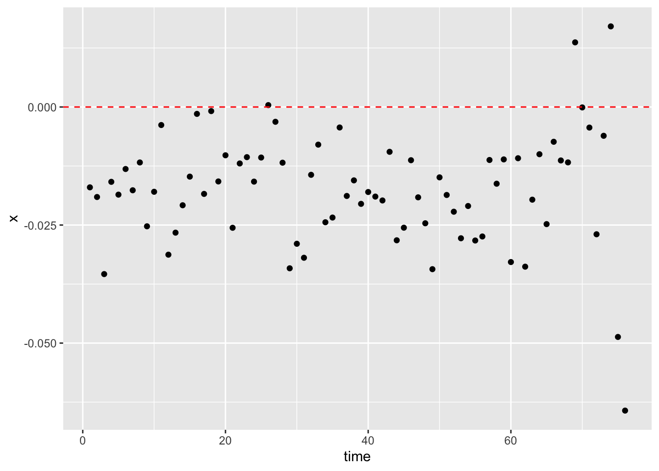
During night times when the sun is set, researchers speculate that stops are made by police officers without the acknowledgment of the racial identity of the driver. This should be the exact opposite for police officers during the day times. With the hope of identifying possible underlying racial discrimination with the available stop data, it has therefore been determined that for a specific region, the differences between the percentage of minority drivers within day times and night times could be used to detect such discrimination. The central idea is that, by observing the distribution of the difference values through the progression of time, we can gain a better understanding of the change of police behaviors with the transformation from day times to night times.
The calculation of the difference for this research project is set to be the daytime percentage of minority drivers (black) being stopped deducted by that of the night time percentage. A positive difference value indicates that if the police officer is able to identify the identity of the driver (i.e., under the day times), she or he has a higher percentage chance of stopping the minority driver. Whereas during the night times with a lack of sufficient light source, we assumed that the police officer was unable to identify the driver’s race. Therefore, if there exists racial discrimination against minority drivers, we should expect to observe that a significant proportion of percentage differences should be positive. However, if the visualization shows an opposite distribution, then we have to conclude that the division of day time and night time has failed to capture the existence of racial discrimination.
SAN <- SAN %>% dplyr::mutate(date2 = lubridate::as_date(lubridate::ymd(as.character(date))))

SAN <- SAN %>% mutate(date_time = as.POSIXct(paste(date,
    time), tz = "America/Chicago", format = "%Y-%m-%d %H:%M:%OS"))

oursunriseset <- function(latitude, longitude,
    date, direction = c("sunrise", "sunset")) {
    date.lat.long <- data.frame(date = date,
        lat = latitude, lon = longitude)
    if (direction == "sunrise") {
        x <- getSunlightTimes(data = date.lat.long,
            keep = direction, tz = "America/Chicago")$sunrise
    } else {
        x <- getSunlightTimes(data = date.lat.long,
            keep = direction, tz = "America/Chicago")$sunset
    }
    return(x)
}

sunrise <- oursunriseset(29.4241, -98.4936,
    SAN$date2, direction = "sunrise")
sunset <- oursunriseset(29.4241, -98.4936,
    SAN$date2, direction = "sunset")

SAN <- cbind(SAN, sunrise, sunset)

SAN <- SAN %>% mutate(light = ifelse(date_time <
    sunrise, "night", ifelse(date_time >
    sunset, "night", "day")))

racial_perc <- function(mon, yr, race) {
    x1 <- filter(SAN, light == "day", month ==
        mon, year == yr)
    x1 <- prop.table(table(x1$subject_race))
    x1 <- as.data.frame(x1)
    x1 <- filter(x1, Var1 == race)$Freq

    x2 <- filter(SAN, light == "night", month ==
        mon, year == yr)
    x2 <- prop.table(table(x2$subject_race))
    x2 <- as.data.frame(x2)
    x2 <- filter(x2, Var1 == race)$Freq

    return(x1 - x2)
}

x <- c()
y <- c()
z <- c()
for (i in seq(2012, 2017)) {
    for (j in seq(1, 12)) {
        diff <- racial_perc(j, i, "black")
        x <- c(x, diff)
        y <- c(y, i)
        z <- c(z, j)
    }
}

diff_data_SAN <- as.data.frame(cbind(x, y,
    z))
diff_data_SAN <- diff_data_SAN %>% mutate(time = 1:nrow(diff_data_SAN))

x <- c()
y <- c()
z <- c()
for (i in seq(1, 4)) {
    diff <- racial_perc(i, "2018", "black")
    x <- c(x, diff)
    z <- c(1, 2, 3, 4)
    y <- c(2018, 2018, 2018, 2018)
}

n <- nrow(diff_data_SAN)
diff_data_SAN2 <- as.data.frame(cbind(x,
    y, z))
diff_data_SAN2 <- diff_data_SAN2 %>% mutate(time = (n +
    1):(n + 4))
diff_data_SAN <- rbind(diff_data_SAN, diff_data_SAN2)


ggplot(data = diff_data_SAN) + geom_point(mapping = aes(x = time,
    y = x)) + geom_hline(yintercept = 0,
    linetype = "dashed", color = "red")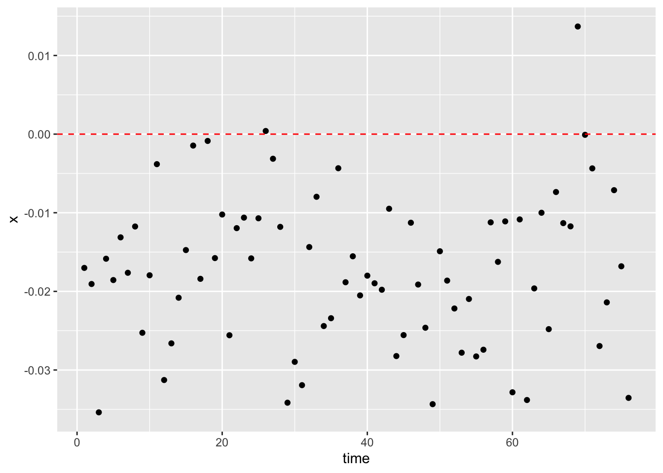
The policing data used for the visualization is from Sanantonio, Texas, and the date is from January 2012 to April 2018. This data recorded a total number of 1,040,428 observations. Key variables are the date of the stop made and the race of the driver, and the corresponding sunrise and sunset time were calculated with each of the given dates. If the stop took place after the sunrise time and before the sunset time, it was set to be a stop made during the day time. Stops that took place outside of this range were set to be night time stops. Then for each day, the percentage of black drivers stopped during day and night was separately calculated and their difference was documented. Finally, the visualization of the key variables was a scatter plot with the horizontal axis as the progression of time and the vertical axis as the day time percentage deducted by night time percentage. For us to claim that the plot has successfully captured the possible existence of racial discrimination, we should expect to observe the majority of the points to be above the horizontal line at zero. However, the scatter plot demonstrates a trend contrary to our expectations. Most of the points fall under the horizontal line, which indicates that for the region of Sanantonio, black drivers on average were stopped at a lower percentage during day time than night time. Using this method and the given data, we have failed the attempt to prove that there has been racial discrimination against black drivers within the data.
One possible downfall of the aforementioned method is that it failed to acknowledge the possible difference in the distribution of driver populations between day time and night time. More specifically speaking, it is likely that for the region of Sanantonio, drivers who are on the road during night time and day time are two completely different population groups, and therefore, comparing the percentages of drivers stopped between these two possibly distinct population might be less meaningful. One possible improvement in the hope of alleviating population distinctions is the “veil of darkness” test, which limits to the stops made only one hour before and after the sunset time. This approach helps to reduce the possible distinction in the racial distribution of the night time and day time drivers. A similar set of procedures to the previous method was conducted, and a second scatter plot was produced. For the second time, the majority of the points are still below the horizontal line, which indicates that even if we have attempted to reduce the possible transformation of racial distribution, black drivers were mostly stopped at a higher percentage during night time relative to that of the day time. Therefore, the second plot has also failed to offer evidence for the existence of racial discrimination in the data for Sanantonio.
SAN2 <- SAN %>% filter(sunset - 3600 < date_time &
    sunset + 3600 > date_time)

racial_perc2 <- function(mon, yr, race) {
    x1 <- filter(SAN2, light == "day", month ==
        mon, year == yr)
    x1 <- prop.table(table(x1$subject_race))
    x1 <- as.data.frame(x1)
    x1 <- filter(x1, Var1 == race)$Freq

    x2 <- filter(SAN2, light == "night",
        month == mon, year == yr)
    x2 <- prop.table(table(x2$subject_race))
    x2 <- as.data.frame(x2)
    x2 <- filter(x2, Var1 == race)$Freq

    return(x1 - x2)
}

x <- c()
y <- c()
z <- c()
for (i in seq(2012, 2017)) {
    for (j in seq(1, 12)) {
        diff <- racial_perc(j, i, "black")
        x <- c(x, diff)
        y <- c(y, i)
        z <- c(z, j)
    }
}

diff_data_SAN <- as.data.frame(cbind(x, y,
    z))
diff_data_SAN <- diff_data_SAN %>% mutate(time = 1:nrow(diff_data_SAN))

x <- c()
y <- c()
z <- c()
for (i in seq(1, 4)) {
    diff <- racial_perc2(i, "2018", "black")
    x <- c(x, diff)
    z <- c(1, 2, 3, 4)
    y <- c(2018, 2018, 2018, 2018)
}

n <- nrow(diff_data_SAN)
diff_data_SAN2 <- as.data.frame(cbind(x,
    y, z))
diff_data_SAN2 <- diff_data_SAN2 %>% mutate(time = (n +
    1):(n + 4))
diff_data_SAN <- rbind(diff_data_SAN, diff_data_SAN2)

ggplot(data = diff_data_SAN) + geom_point(mapping = aes(x = time,
    y = x)) + geom_hline(yintercept = 0,
    linetype = "dashed", color = "red")