library(tidyverse) # ggplot, lubridate, dplyr, stringr, readr...
library(praise)Economic Diversity and Student Outcomes
Data
The data explores economic diversity and student outcomes. The dataset this week comes from Opportunity Insights and is described in its codebook.
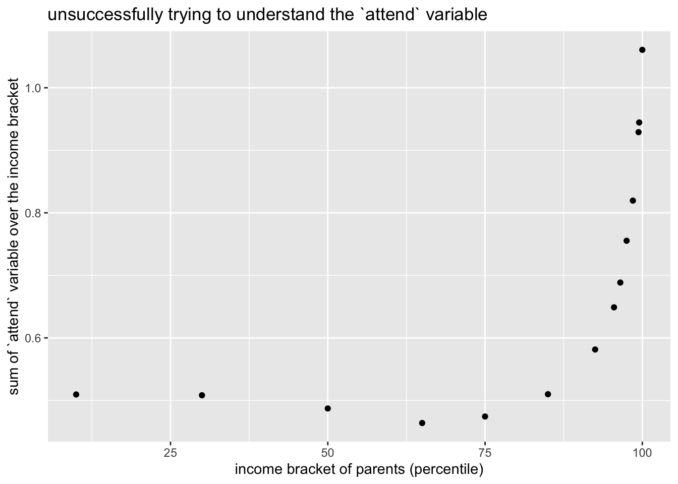
Unfortunately, the data aren’t easy to interpret. In the work below, we use the variable attend, but we aren’t sure what it means. It is vaguely close to the proportion of students [out of those who take the SAT/ACT and are in a given income bracket] who would attend a given college.
college_admissions <- readr::read_csv('https://raw.githubusercontent.com/rfordatascience/tidytuesday/master/data/2024/2024-09-10/college_admissions.csv')college_admissions |>
select(name) |>
distinct()# A tibble: 139 × 1
name
<chr>
1 American University
2 Amherst College
3 Auburn University
4 Barnard College
5 Bates College
6 Baylor University
7 Binghamton University
8 Boston College
9 Boston University
10 Bowdoin College
# ℹ 129 more rowsThere are 139 institutions in the dataset.
Next, we try to suss out the variable attend, we would have expected it to sum to 1 given a particular income group. However, it doesn’t sum to one for
college_admissions |>
  group_by(par_income_bin) |>
  summarize(prob_attend_sum = sum(attend, na.rm = TRUE)) |>
  ggplot(aes(x = par_income_bin, y = prob_attend_sum)) +
  geom_point() +
  labs(x = "income bracket of parents (percentile)",
       y = "sum of `attend` variable over the income bracket",
       title = "unsuccessfully trying to understand the `attend` variable")
Regardless, we will continue with the attend variable as some measure of attendance as a function of income percentile of the parents. The code for highlighting the lines was taken from Augmenting data exploration with interactive web graphics by Carson Sievert.
library(plotly)
library(crosstalk)

admiss <- SharedData$new(college_admissions, ~name)
gg1 <- admiss |>
  ggplot(aes(x = par_income_bin, y = attend, color = public,
             text = paste0("school: ", name))) +
  geom_point() +
  geom_line() +
  facet_grid(~ public) +
  labs(color = "Public School",
       x = "parental income bin",
       y = "something about % attendance")


gg2 <- ggplotly(gg1, tooltip = "text")

plotly::highlight(gg2, on = "plotly_hover")
By hovering over the lines we can see the relationship between the parental income percentile and the attendance variable for each of the 139 institutions in the study. The private schools all tend to go up for the highest incomes. The majority of public schools go down for the highest incomes.
praise()[1] "You are extraordinary!"