Making a Shiny App

Author

Jo Hardin

Published

April 16, 2024

── Attaching core tidyverse packages ──────────────────────── tidyverse 2.0.0 ──
✔ dplyr     1.1.4     ✔ readr     2.1.5
✔ forcats   1.0.0     ✔ stringr   1.5.1
✔ ggplot2   3.5.0     ✔ tibble    3.2.1
✔ lubridate 1.9.3     ✔ tidyr     1.3.1
✔ purrr     1.0.2     
── Conflicts ────────────────────────────────────────── tidyverse_conflicts() ──
✖ dplyr::filter() masks stats::filter()
✖ dplyr::lag()    masks stats::lag()
ℹ Use the conflicted package (<http://conflicted.r-lib.org/>) to force all conflicts to become errors

Data

Going back to the crop data from 09/01/2020 because it has a lot of variables to work with within the Shiny framework.

Global Crop Yields

The data this week comes from Our World in Data. Note that there is a lot of data on that site, we’re looking at some subsets but feel free to use whatever data from there you find interesting! It’s all pretty clean and ready to go.

Rows: 13075 Columns: 14
── Column specification ────────────────────────────────────────────────────────
Delimiter: ","
chr  (2): Entity, Code
dbl (12): Year, Wheat (tonnes per hectare), Rice (tonnes per hectare), Maize...

ℹ Use `spec()` to retrieve the full column specification for this data.
ℹ Specify the column types or set `show_col_types = FALSE` to quiet this message.

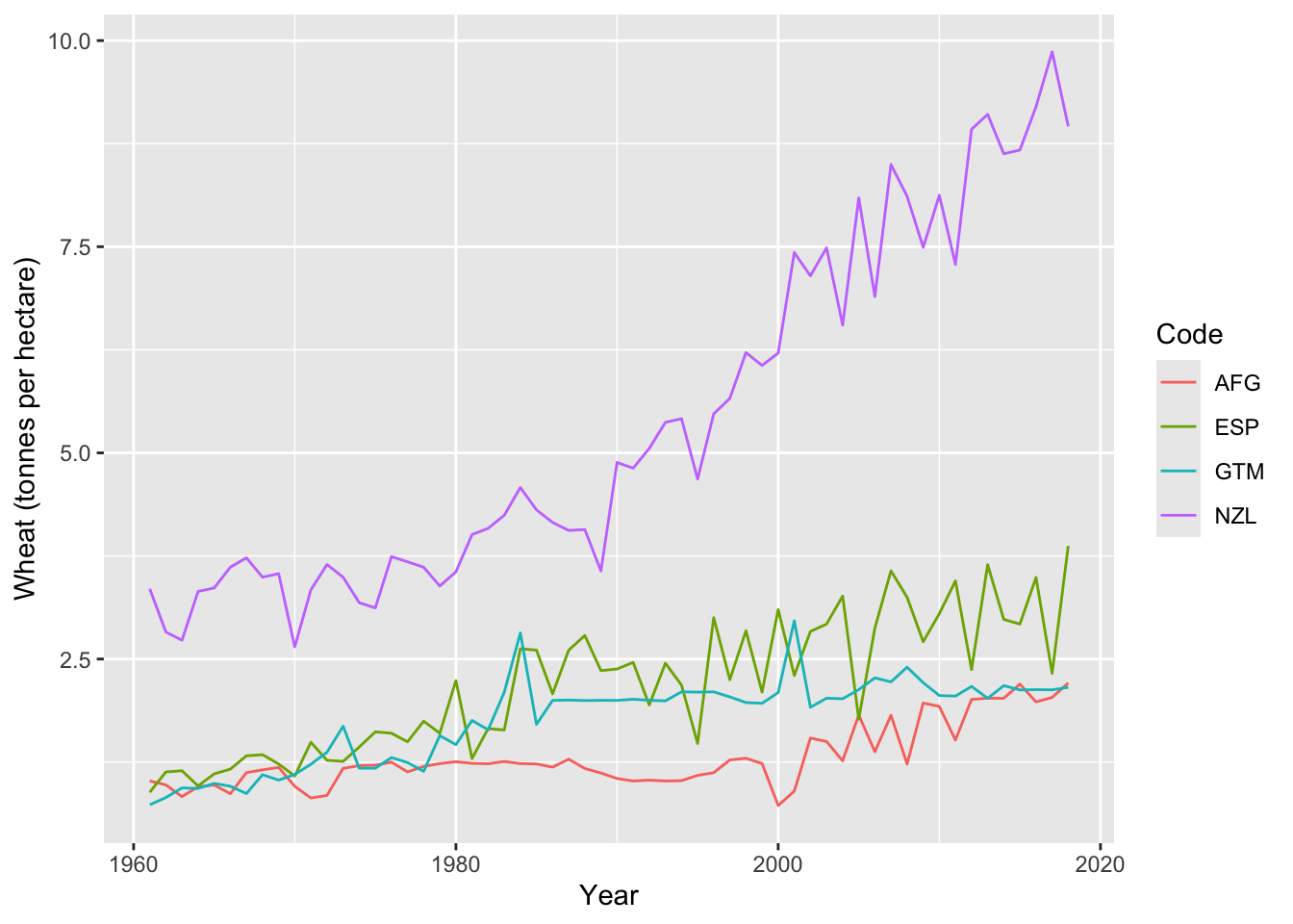
Let’s start by creating a static plot that we can extend within the Shiny app.

Wheat crop yield over time for Afghanistan (AFG), Guatemala (GTM), Spain (ESP), and New Zealand (NSL).

Using all of the countries and the eleven different types of crops, we can build a Shiny app to describe how the yields change over time.

The first chunk of Shiny code creates the interactive buttons that allow the user to specify what variables they want to use. The second chunk of Shiny code uses the input variables in the ggplot itself.