library(tidyverse)
library(viridis)
library(RColorBrewer)
library(praise)Big Tech Stock Prices
The Data
The data this week comes from Yahoo Finance via Kaggle (by Evan Gower).
prices <- readr::read_csv('https://raw.githubusercontent.com/rfordatascience/tidytuesday/master/data/2023/2023-02-07/big_tech_stock_prices.csv')
companies <- readr::read_csv('https://raw.githubusercontent.com/rfordatascience/tidytuesday/master/data/2023/2023-02-07/big_tech_companies.csv')
The task
Today we did TidyTuesday as a group. Many of the graphs below come from suggestions from the group.
Stock prices over time
prices %>%
  filter(stock_symbol %in% c("INTC", "AAPL", "NFLX")) %>%
  ggplot(aes(x = date, y = open, color = stock_symbol)) +
  #geom_point(size = 0.5) +
  geom_line() +
  geom_vline(xintercept = as.Date("2020-10-01")) +
  annotate("rect", xmin = as.Date("2020-03-13"), xmax = as.Date("2021-9-01"), ymin = 0, ymax = 700,
           alpha = .7,fill = "grey") +
  #scale_color_viridis(discrete = TRUE) +
  #scale_color_brewer(palette = "Dark2") +
  scale_color_manual(values = c("red", "blue", "purple"))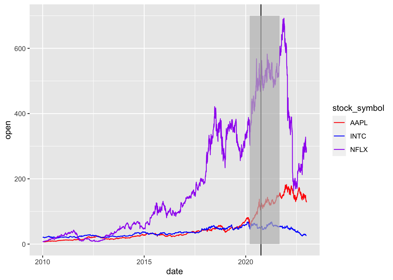
prices %>%
  filter(stock_symbol %in% c("AAPL")) %>%
  ggplot(aes(x = open, y = close)) +
  geom_point()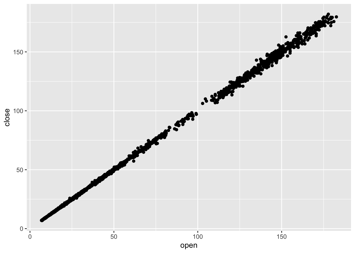
prices %>%
  filter(stock_symbol %in% c("NFLX")) %>%
  ggplot(aes(x = date, y = high - low)) +
  geom_point()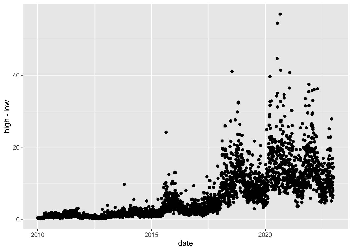
prices %>%
  filter(stock_symbol %in% c("AAPL")) %>%
  ggplot(aes(x = date)) +
  geom_ribbon(aes(ymin=low,
                 ymax=high), color = "black") +
  geom_line(aes(y = close), color = "white", size = .1) +
  xlim(c(as.Date("2022-01-01"), as.Date("2022-12-01")))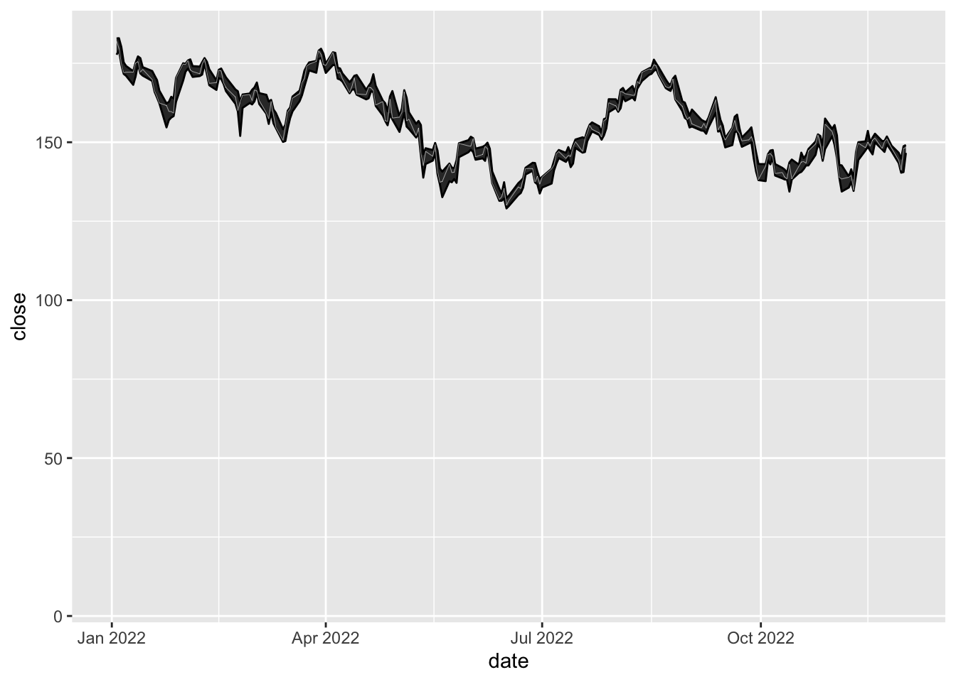
prices_wide <- prices %>%
  pivot_wider(id_cols = date, names_from = stock_symbol, values_from = open)


prices_wide %>%
  mutate(all_open = AAPL + ADBE + AMZN + CRM + CSCO) %>%
  ggplot(aes(x = date, y = all_open)) +
  geom_line()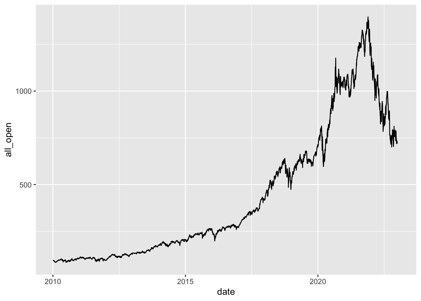
prices %>%
  #filter(stock_symbol == "NFLX") %>%
  ggplot(aes(x = date, y = close, color = stock_symbol)) +
  geom_line() +
  xlim(c(as.Date("2020-03-01"), as.Date("2020-09-01"))) +
  scale_y_log10()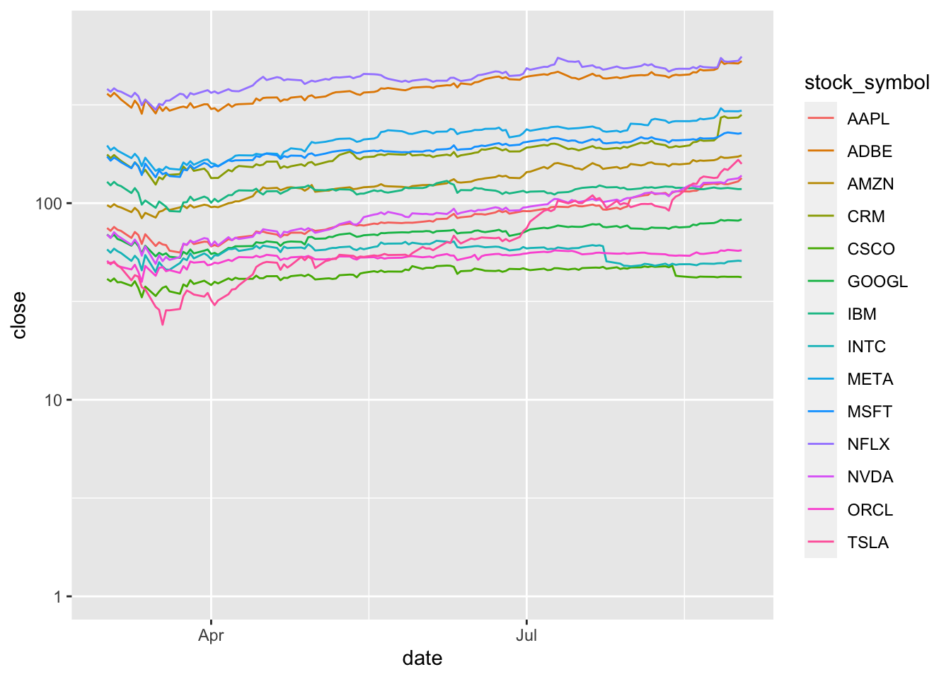
praise()[1] "You are impeccable!"